
Unsolicited Design Case Study
Designing the PitchSense AI MVP — How I’d approach habit formation and AI sales coaching in an early-stage product
Role:
Product Designer
Company:
HSV Digital (if you guys hired me)
Read Time:
5 minutes
Timeline:
May 5, 2026 - May 7, 2026
Platform:
Web Application
Focus Areas:
Retention & Habit Design, Psychological Safety in UX, Deliberate Practice Loops, MVP Scoping & Validation
Context;
I built this unsolicited design exploration to show how I think, scope, and deliver — using nothing but the public PitchSense AI vision.
My Real Challenge (Why This Case Study Exists)
PitchSense AI has a core mechanic: users practice live conversations against dynamic AI personas. Real feedback. Real stakes.
But there's a design problem hiding here: How do you make "conversational practice" a habit instead of a one-time tool?
Most pitch coaching products fail at retention. Users practice once (before a big moment), get feedback, and disappear forever. Event-driven. Not habit-driven.
My Design Challenge
Design an MVP that transforms the conversational simulation from an event-driven tool into a retention-focused platform. What structure makes users come back consistently? What makes them want to practice every day?
My MVP Design
I designed six core elements. Each one solves a specific retention problem.
[01]
Streak Counter
One number on screen (5 days 🔥).
Psychologically proven to drive behavior change.
Users protect their streak.

[02]
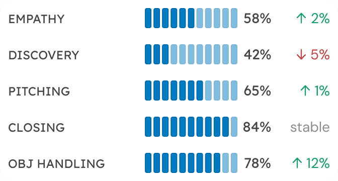
Skill Breakdown Chart
Users see WHERE they improved: empathy +3%, objection handling +12%, discovery flat.
Not just "you got better."
But something specific and motivating.
[03]
Session Scores
Every sim gets a score (84/100, 47/100, 91/100).
Users see immediate feedback.
They know when they improve.
Dopamine hit.
Reason to retry.


[04]
One-Skill Focus
User picks ONE skill to focus on (objection handling, pacing, clarity).
Not overwhelmed.
Can iterate.
Can see improvement in that ONE metric.
[05]
User-Defined Context
User says: "I'm pitching to a budget-skeptical ops lead at Acme. He's skeptical. 10 minutes."
System generates AI that responds to THAT.
Not generic.
User-owned stakes.


[06]
Coaching Feedback
In-call nudges guide without judging ("pause and acknowledge").
Post-session analysis shows what failed and why. Users feel coached, not surveilled.
Product Design-


Home Page

Quick Simulator Launch

Quick Simulator Launch - Typing Context

Simulator Preview - Confirmation

Simulation Started

Simulation - Spark Tip

Simulation - Toggle to Voice

Simulation - Voice Interaction

Simulation - Chat Ended

The prototype
My Strategic Thesis
These six elements aren't random. They're answers to a single strategic question: How do I create habit in a practice tool?
The Core Thesis
Combine:
visible progress (skill chart) + streak gamification (5 days) + psychological safety (coaching feedback) + clear iteration loops (one-skill focus) + realistic scenarios.
Together, these shift from event-driven to habit-driven.
Why Each Lever Matters
How I'd Execute This
Design Decision 1: Dashboard Is The Habit Engine
User opens app. They see:
"Your streak: 5 days 🔥" — "I don't want to break this. I need to practice today."
"Score: 78 (Excellent)" — "I'm improving. This is working."
Skill chart (5 metrics) — "I'm strong in empathy, weak in discovery. Here's what to work on."
Recent sessions (84/100, 47/100, 91/100) — "I improved from 47 to 91. Momentum."
Message: "You're improving. Don't stop." This is habit activation in one screen.
Design Decision 2: One-Skill Focus Removes Friction
User enters a simulation trying to improve 5 skills at once.
Cognitive overload.
Feedback is scattered.
They don't know what to focus on.
They don't retry.
Quick Suggestions - Default

Quick Suggestions - Expanded

Instead: User picks ONE skill. "Today I'm practicing objection handling." Why? Because then:
Clear intention entering the conversatiom
Focused feedback after ("Your objection handling was strong")
Immediate retry with that feedback
See measurable improvement in ONE metric
Clarity enables iteration. Iteration drives improvement. Improvement drives return.
Design Decision 3: User-Defined Context Creates Real Stakes
Generic coaching: "Practice your pitch."
—User doesn't control the scenario.
—No pressure.
—Doesn't feel real.
My approach: User DEFINES the scenario. User provides:
Who: "Budget-skeptical ops lead at Acme Corp"
Context: "He's been burned by shelfware before"
Objective: "Get him to agree to a 2-week pilot"
Constraints: "He's got 10 minutes. Direct. Pressed for time."
System generates AI that responds to THAT specific context.
Now: User has a real conversation with stakes THEY defined.
AI doesn't just listen.
It interrupts. It pushes back.


This is authentic practice. Users practice for actual upcoming meetings. Not theoretical. Real.
Design Decision 4: Feedback Designed for Iteration
After simulation:
One Key Insight: "Your objection handling was strong. Discovery could improve."
Spark Tip: Real-time coaching ("Pause and acknowledge his budget concern")
Lost Opportunity Card: "You didn't address his main pain. Retry focusing on his biggest risk."
Feedback after simulation:

Also: "Retry?" One click. Same scenario. New intention.

This is authentic practice. Users practice for actual upcoming meetings. Not theoretical. Real.
How I'd Validate This Design
If my thesis is correct, this MVP should prove:
40%+ week-2 return rate
2+ simulations per session
60%+ with active streaks
Zero "I felt judged" feedback
Measurable skill improvement week-over-week
What It Proves
Habit formation is working. Users with active streaks come back. Core thesis validated.
Users iterate because feedback is clear and actionable. Not one-and-done practice.
Users are committed. They're building practice habits, not one-time practicing.
Psychological safety is working. Users feel coached, not surveilled. They practice longer.
Users see progress. Visible improvement drives continued practice.
If any of these fail, I'm re-evaluating the thesis:
Week-2 return < 25%: Habit thesis is wrong. Redesign or admit this product can't be habit-driven.
Avg. sims per session < 1.5: Users aren't iterating. Core loop is too high-friction. Redesign.
20%+ "I felt judged" feedback: Safety messaging isn't working. Redesign urgently.
No measurable skill improvement: Feedback isn't working. Redesign the feedback system.
What I'd Bring to HSV Digital
This case study shows how I approach design problems:
I figure out what actually matters. That means understanding retention and user behaviour deeply.
Validation mindset. I define success before designing, set directional metrics, and build kill criteria into the MVP so we learn fast and don't overbuild.
Speed and ownership. I built this case study in 48 hours with zero internal data. Give me access to your users, engineers, and product lead, and that speed compounds.
Practical MVP thinking. I prefer smaller systems with tighter feedback loops over feature-heavy products, focusing on clarity, iteration speed, and repeated usage behavior.
I want to work with teams that move fast and ship products that matter. This case study is proof of how I think.