


T*****
Design System
DRAG TO MOVE


Role:
Sole Product Designer
Company:
IoT83
Read Time:
5 minutes
Timeline:
April 30, 2024 - Ongoing
Platform:
B2B Web Applications (5+ web apps)
Focus Areas:
Design System, Consistency, Prototyping, Developer Handoff
TLDR;
Built and scaled a design system across 5+ B2B web applications to reduce design debt, improve development efficiency, and enable faster feature delivery without disrupting ongoing sprints.
Context
I joined the team as the sole product designer supporting multiple client facing B2B web applications. There was no design team and no existing design system.
Work was already shipping across 5+ apps. Each product had grown on its own timeline, which meant the UI reflected many small, uncoordinated decisions made over time.
My responsibility was simple to state but harder to execute: bring consistency without slowing the team down.
THE problem
[01]
No Consistency
Button in Product A had different shade of blue, Product B had different. Same component, no standard.
[02]
Slow Handoffs
Every design handoff triggered 30-minute calls about padding and spacing.
[03]
Design Debt
Same thing built differently across 5 products. Engineers kept rebuilding instead of reusing.
[04]
Can't Scale
One designer couldn't support 5 products because everything was custom.


THE CONSTRAINT
In a perfect world, I would have paused feature work for a few weeks and built the system cleanly from the ground up.
That was not the reality.
Active development sprints were already in motion, and product work could not stop. Features still had deadlines, and engineering still needed designs on time.
So the design system had to grow in parallel with live product delivery. That constraint shaped the entire strategy.
the approach
I structured the system using atomic principles:
Foundation → Atoms → Molecules → Organisms → Templates.
But instead of building the whole library upfront, I worked incrementally.
Instead of building the full library upfront, I worked in cycles.
After each feature handoff, while developers were in their sprint, I reviewed the work, extracted reusable patterns, standardized them, and added them to the system. Those components were then reused in the next feature.
This kept product work moving while the system matured.
Process gap I discovered a little too late-
Spacing variables were introduced after roughly 80% of the components were already built.
Once applied, they exposed:
uneven padding
small alignment inconsistencies
spacing mismatches across variants
This required revisiting several components.
Since then, I treat variables as part of the foundation rather than a later cleanup step.
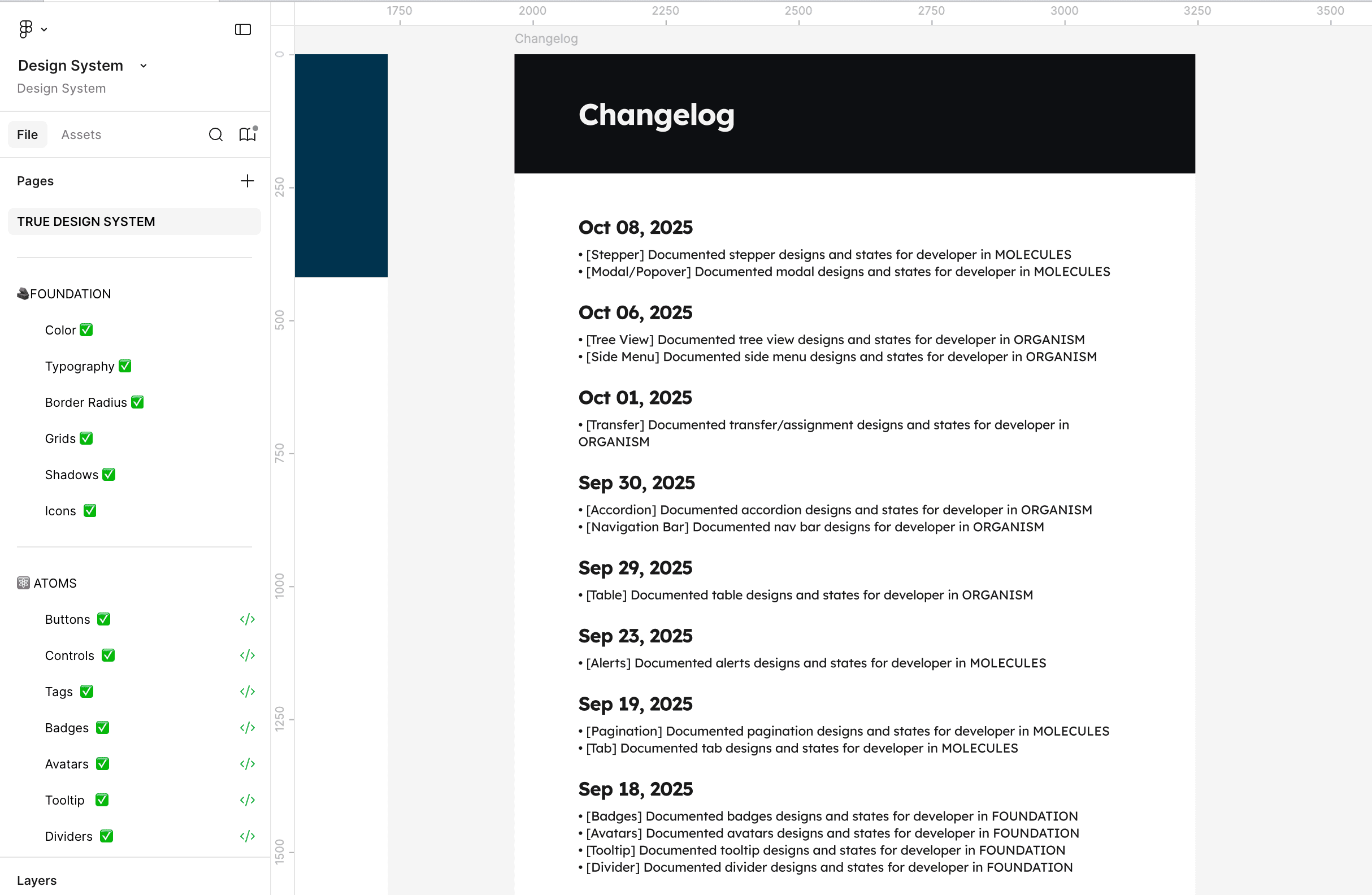
what i built


Few glimpses of components i built-


Click to View · Design System
developer collaboration
Each major design required reviews with backend, frontend, and QA.
Before the system stabilized
review calls often took 40 to 50 minutes
many questions were about edge cases
After molecules and organisms were completed
most reviews dropped to 20 to 30 minutes
my walkthrough typically took 5 to 10 minutes
discussions became more focused
The main change was improved clarity and reuse.
Adoption and Pushback
Core components started getting reused across multiple active apps. Tables, form controls, and navigation patterns saw the fastest pickup.
Spacing variables also began showing up consistently in newer screens once they were properly wired in.
This was the point where the system started feeling real instead of aspirational.
Not every component was accepted on the first pass. Several patterns were pushed back during product and engineering review.
The most friction came from:
Transfer component
Button redesign
Tree view restructure
Earlier feedback also flagged issues in Pagination, Input, and Dropdown, which were later revised and are shipped as of today.
Month 1-2
~20% of new designs using system (system still incomplete)
Month 3-4
~40% adoption (atoms/molecules becoming useful)
Month 5+
~80% adoption (library mature, developers seeing time savings)
Growth drivers
System became actually useful (not just aspirational)
Better documentation in Storybook
Engineers saw real time savings
THE IMPACT
What this meant for the team:
On the business side:
This is really good.
The distinction between primary secondary and tertiary actions is much clearer now.
Before this it wasn’t always obvious what should take priority.
This makes it a lot easier to review flows.
Great work!
—Brendan Lehman, Product Owner @Truemfg
I no longer have to ask questions related to uneven padding, spacing between same states of components, now it's much easier for me to develop and saves a lot of back-and-forth.
—Amit Joshi, Frontend Lead @Truemfg
Before and After compaison —


what i'd do differently
If I restarted this work:
Introduce variables at the beginning (we learned this 80% in) → Would have saved ~40 hours of rework
Validate with engineering earlier → Transfer and Button components had unnecessary revision cycles
Map component state matrices upfront → Would have caught edge cases before production
Not having a senior designer slowed some decisions → What I'd do: Get design review from peer earlier (we only had PM reviews)
Prototype of a "search" component to help developer understand how it should work —
NEXT STEPS
The system is still in progress.
Current focus:
completing organism level variable alignment
expanding edge case coverage
refining the transfer component
improving the button system
strengthening documentation
enabling developer contribution
The goal is to make the system easier to maintain and scale.